Best Free Fonts for UI/UX Designers in 2023
Bodoni: Bodoni is a modern and elegant serif font that works well for headings and titles. It has a clean and distinctive look that is well-suited for use in high-end design projects.Choosing the right fonts is an essential aspect of UI/UX design, as they play a significant role in the user's experience. Fonts can affect readability, accessibility, and the overall look and feel of the interface. With so many font options available, it can be challenging to know which ones to choose.
In this article, we will explore some of the best fonts for UI/UX design. We will look at factors like readability, versatility, and aesthetics to identify fonts that work well in a variety of design contexts. Whether you're designing a website, app, or other digital interface, this article will help you choose the right fonts for your project.
We will cover popular font families like Sans-serif, Serif, and Display fonts, as well as their variations and combinations. We will also discuss some tips on how to use fonts effectively, including font pairing and hierarchy, to create a visually appealing and easy-to-read user interface.
Having said that, here are some ways in which the right choice of fonts can improve an interface:
Readability:
The primary function of fonts is to make text readable. Choosing a font that is easy to read can significantly improve the user experience. Factors like font size, line spacing, and letter spacing can also affect readability.
Branding:
Fonts can help establish the visual identity and brand of an interface. Consistent use of fonts across the interface can reinforce the brand and improve brand recognition.
Hierarchy:
Fonts can be used to create a visual hierarchy of information. For example, using a larger font size or a bold font for headings and a smaller font size for body text can help users quickly scan and understand the content.
Mood and Tone:
Fonts can help set the mood and tone of an interface. For example, a serif font can convey a sense of elegance and sophistication, while a sans-serif font can convey a sense of modernity and simplicity.
Accessibility:
Choosing an accessible font can help users with visual impairments or reading disabilities. Fonts that are easy to read and have high contrast can make a significant difference in the user experience.
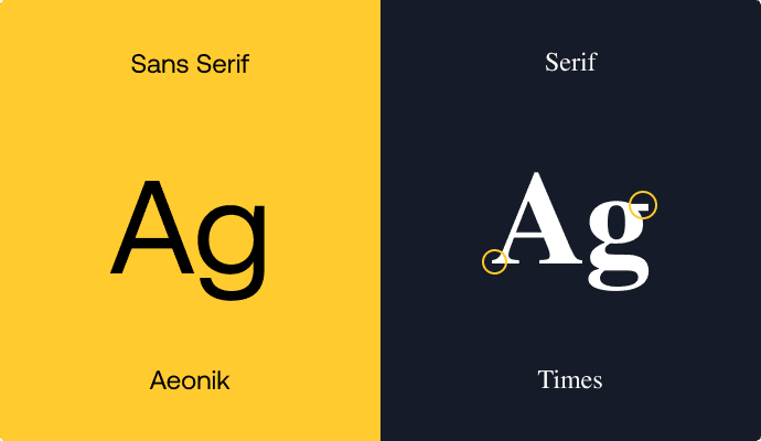
Difference between Serif and Sans-Serif Fonts
Sans-serif and serif fonts are two different types of typefaces that have distinctive features and are used for different purposes.
Serif fonts have small lines, called serifs, at the end of each letter stroke. These lines add a decorative element to the letters and create a sense of continuity between letters. Serif fonts are often associated with traditional and classic design, and they are commonly used in printed materials such as books, newspapers, and magazines. Serif fonts are known for their legibility, especially in long passages of text, because the serifs help guide the eye from one letter to the next.
Sans-serif fonts, on the other hand, do not have serifs on the end of each letter stroke. Sans-serif fonts have a clean and modern look, and they are often used in digital and screen-based design such as websites, apps, and user interfaces. Sans-serif fonts are known for their simplicity and legibility, especially at smaller sizes, because they have fewer decorative elements to distract the eye.
In terms of style, serif fonts are often associated with elegance, formality, and tradition, while sans-serif fonts are often associated with modernity, simplicity, and minimalism. Serif fonts are generally used in print and digital design where a more traditional or formal look is desired, while sans-serif fonts are generally used in digital design where a clean and modern look is desired.
In summary, serif and sans-serif fonts differ in their appearance, legibility, and usage. Serif fonts have decorative lines at the end of each letter stroke and are associated with traditional and classic design, while sans-serif fonts have a clean and modern look and are often used in digital design.
Best Free Sans-Serif Fonts
These sans-serif fonts are popular choices for UI/UX designers because of their clean, modern, and easily readable characteristics. They come in multiple weights and styles, making them versatile and suitable for a variety of design projects. When choosing a font, it's important to consider factors such as readability, versatility, and style. By choosing the right font, UI/UX designers can create effective and visually appealing designs that are easy to read and navigate.

Inter: Inter is a versatile sans-serif font designed specifically for digital screens. It has a modern and clean look and is highly readable, even at smaller sizes. Inter comes in multiple weights and styles, making it a great choice for UI/UX designers who need a flexible and versatile font.
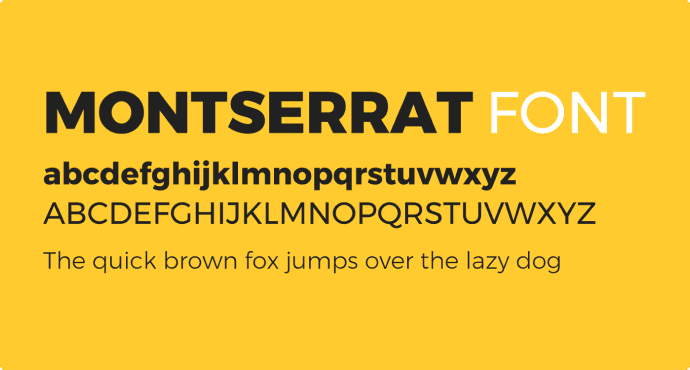
Montserrat: Montserrat is a geometric sans-serif font designed by Julieta Ulanovsky. It has a modern and clean look and is highly readable, even at smaller sizes. Montserrat comes in multiple weights and styles, making it a great choice for UI/UX designers who need a flexible and versatile font.

Proxima Nova: Proxima Nova is a popular and versatile sans-serif font designed by Mark Simonson. It has a modern and clean look and is highly readable, even at smaller sizes. Proxima Nova comes in multiple weights and styles, making it a great choice for UI/UX designers who need a flexible and versatile font.
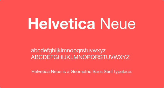
Helvetica Neue: Helvetica Neue is a classic sans-serif font that has been popular in UI/UX design for many years. It has a clean and modern look and is highly readable, even at smaller sizes. Helvetica Neue comes in multiple weights and styles, making it a great choice for UI/UX designers who need a flexible and versatile fonts.
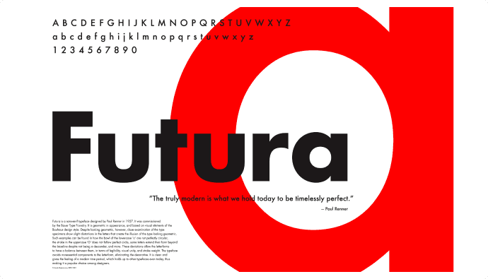
Futura: Futura is a classic and modern sans-serif font that has been used in design for many years. It has a clean and geometric look that is well-suited for use in branding and editorial design.
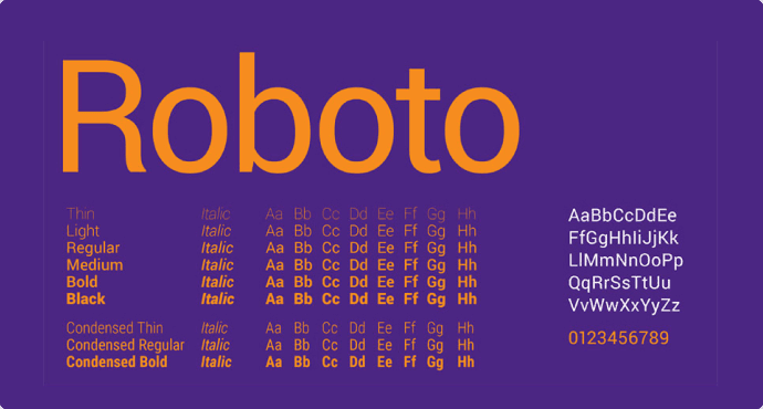
Roboto: Roboto is a modern sans-serif font designed by Christian Robertson. It has a clean and modern look and is highly readable, even at smaller sizes. Roboto comes in multiple weights and styles, making it a great choice for UI/UX designers who need a flexible and versatile font.
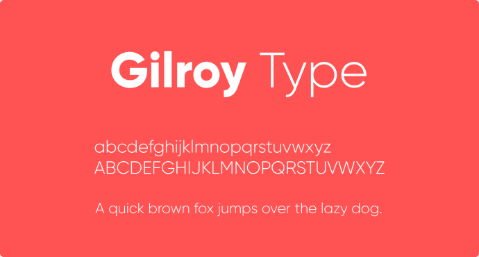
Gilroy: Gilroy is a geometric sans-serif font designed by Radomir Tinkov. It has a modern and clean look and is highly readable, even at smaller sizes. Gilroy comes in multiple weights and styles, making it a great choice for UI/UX designers who need a flexible and versatile font.

Avenir Next: Avenir Next is a clean and modern sans-serif font that is well-suited for use in branding and design. It has a distinctive look that is both elegant and readable.
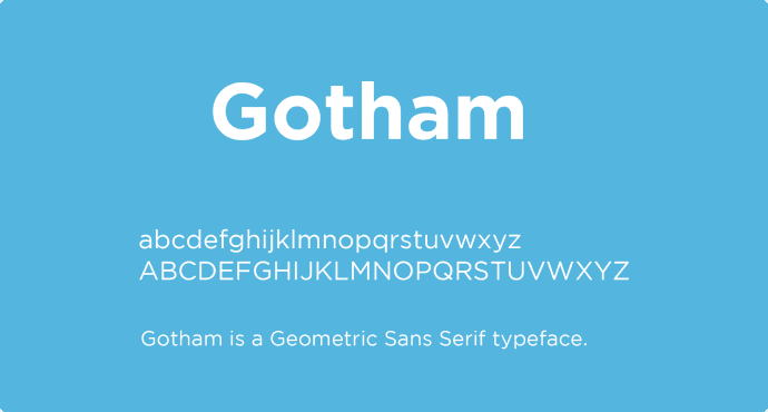
Gotham: Gotham is a modern and versatile sans-serif font that is widely used in branding and design. It has a clean and distinctive look that is highly readable and works well for body text and headings.
Best Free Serif Fonts
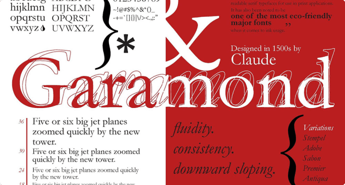
Adobe Garamond Pro: Adobe Garamond Pro is a classic serif font that has been used in print design for many years. It has a distinctive look that is both elegant and readable, making it a great choice for a variety of design projects.

Didot: Didot is a classic and elegant serif font that is well-suited for use in luxury branding and editorial design. It has a distinctive and refined look that works well for headings and titles.

Bodoni: Bodoni is a modern and elegant serif font that works well for headings and titles. It has a clean and distinctive look that is well-suited for use in high-end design projects.

Baskerville: Baskerville is a classic serif font that has a clean and elegant look. It is highly readable and works well for body text and headings. Baskerville is a versatile font that can be used in a variety of design projects.

Merriweather: Merriweather is a modern serif font that is highly readable and works well for body text and headings. It has a clean and elegant look that is well-suited for use in UI/UX design. Merriweather comes in multiple weights and styles, making it a flexible choice for designers.

Crimson Text: Crimson Text is a versatile serif font that is well-suited for use in UI/UX design. It has a clean and modern look that is highly readable, even at smaller sizes. Crimson Text comes in multiple weights and styles, making it a flexible choice for designers.

Georgia: Georgia is a classic serif font that has been used in web design for many years. It has a distinctive look that is both elegant and modern. Georgia is highly readable and works well for body text and headings.
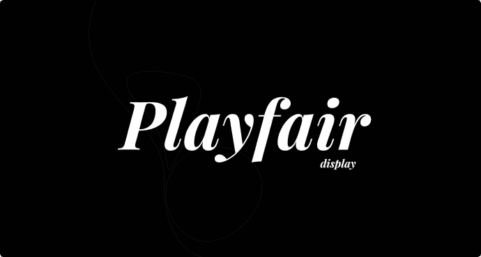
Playfair Display: Playfair Display is an elegant and modern serif font that works well for headings and titles. It has a distinctive look that is both classic and contemporary. Playfair Display comes in multiple weights and styles, making it a versatile choice for UI/UX designers.
Accessibility considerations

Choosing the right font is an important aspect of designing for accessibility. Here are some accessibility considerations to keep in mind when choosing a font for your interface:
Legibility:
The most important consideration when choosing a font for accessibility is legibility. The font must be easily readable by all users, including those with visual impairments. This means choosing a font that is clear, simple, and easy to read at a range of sizes.
Size:
Font size is another important consideration. Fonts should be large enough to be easily read by users with visual impairments, but not so large that they dominate the interface. The recommended minimum font size for body text is 16 points, and for headings is 18-24 points.
Contrast:
Contrast is important for users with low vision or color blindness. Text should have high contrast with the background, so it's easy to read. Dark text on a light background or light text on a dark background is generally recommended.
Typeface:
The typeface of a font can also affect legibility. Sans-serif fonts are generally easier to read on digital screens because they have simple, clean lines. Serif fonts can be more difficult to read, especially at smaller sizes.
Style:
The style of the font can also impact readability. Avoid using fonts with unusual or decorative shapes that can be difficult to read. Stick to simple, clean fonts that are easy to read at a glance.
Language:
Finally, consider the language of your audience. Fonts that are designed for English may not be as effective for other languages. For example, some languages may require special characters or diacritical marks that are not included in certain fonts.
Wrapping Up
Choosing the right fonts is a crucial part of creating an effective and visually appealing UI/UX design. In this article, we have explored some of the best fonts for UI/UX design, including popular font families like Sans-serif, Serif, and Display fonts, as well as their variations and combinations. We have looked at factors like readability, versatility, and aesthetics to identify fonts that work well in a variety of design contexts.
Additionally, we have discussed some tips on how to use fonts effectively, including font pairing and hierarchy, to create a visually appealing and easy-to-read user interface. We have emphasized the importance of considering the user's needs, goals, and preferences when selecting fonts and creating a design language.
Overall, by choosing the right fonts and using them effectively, designers can create a user-friendly and aesthetically pleasing user interface that enhances the user's experience. The fonts discussed in this article provide a starting point for designers to choose the best fonts for their projects, and the tips provided can help designers use fonts effectively to create a cohesive and visually appealing design language.