Best Icon Sets for UI/UX Designers in 2023
Icons are an essential part of UI/UX design, as they provide visual cues and help users understand the interface's functions quickly. With so many icon sets available, it can be challenging to know which ones to choose.
In this article, we will explore some of the best free icons for designers. We will look at factors like style, variety, and customization to identify icon sets that work well in a variety of design contexts. Whether you're designing a website, app, or other digital interface, this article will help you choose the right icon sets for your project by means of outlining the principles that govern good designs.
Icons play an essential role in UI/UX design by providing visual cues that help users understand and interact with digital products. Here are some reasons why icons are important in UI/UX design:
Visual communication
Icons are a universal language that can communicate complex ideas and actions quickly and easily. They provide visual cues that help users understand the purpose and functionality of different elements within an interface.
User experience
Icons can enhance the user experience by making interfaces more intuitive and user-friendly. Well-designed icons can guide users through a product's features and functions, making it easier to complete tasks and achieve their goals.
Consistency and brand identity
Icons can help maintain consistency and brand identity across a product. By using a consistent set of icons, designers can create a cohesive and recognizable visual language that reinforces the product's brand identity.
Space-saving
Icons take up less space than text, making them ideal for use in interfaces where space is at a premium. This allows designers to convey more information in less space, without overwhelming the user with too much text.
Accessibility
Icons can improve accessibility for users who have difficulty reading or understanding text. They provide a visual alternative to text-based labels, making interfaces more accessible to a wider range of users.
Overall, icons are an essential component of UI/UX design, providing visual cues that help users understand and interact with digital products. When used effectively, icons can enhance the user experience, maintain consistency and brand identity, save space, and improve accessibility.
Considerations when working with Icons

Meaning and clarity
Icons should have clear and recognizable meanings that are consistent across the interface. Avoid using icons that are ambiguous or difficult to understand. Consider conducting user testing to ensure that the icons are effective and clear.
Size and spacing
Icons should be sized appropriately and spaced in a way that is easy to understand and use. Consider the size and resolution of the device screen and the distance between icons to ensure that they are easily distinguishable.
Consistency and style
Icons should be consistent in style and color, and should match the overall style and branding of the interface. Consider using an icon set that has a consistent style to maintain consistency throughout the interface.
Accessibility
Consider accessibility when choosing and designing icons. Avoid using icons that rely on color alone, and provide alternative text or labels for users who are visually impaired.
Interactivity
Icons can be interactive and should respond to user actions in a clear and consistent way. Consider providing hover or active states to indicate when an icon can be clicked or interacted with.
Context
Consider the context in which the icons will be used, and ensure that they are appropriate for the task or action being performed. Avoid using icons that are irrelevant or confusing.
Choosing between a solid, outline or duotone icon set

Solid, outline, and duotone are popular styles of icons in UI/UX design. Each style has its unique characteristics and can be used to achieve different design goals. Here is a brief overview of each style:
Solid icons
Solid icons are filled with a single color and have a consistent shape and weight. They are bold, simple, and easy to read, making them ideal for interfaces that require quick recognition. Solid icons are also popular for their versatility, as they can be used in a wide variety of contexts.
Outline icons
Outline icons are a minimalist version of solid icons. They are composed of thin lines and have no fill, which makes them visually lightweight and delicate. Outline icons are best used for interfaces that require a modern, elegant, and clean look.
Duotone icons
Duotone icons are a two-tone version of solid or outline icons. They use two contrasting colors to create a subtle shading effect, which adds depth and dimension to the icon. Duotone icons are popular for their versatility and ability to evoke emotion and mood.
Choosing the right icon style depends on the design goals and the context in which the icons will be used. For example, solid icons may be more suitable for interfaces that require quick recognition and readability, while outline icons may be more suitable for interfaces that require a clean and modern look. Duotone icons may be suitable for interfaces that require depth and mood. Ultimately, the style of icons should be consistent with the overall design language and the user experience.
Top Icon Sets

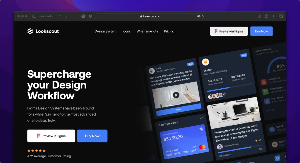
Lookscout Icons: The Lookscout free icons set is a set of more than 1200 vector icons in an outline style. Furthermore, there is a premium icon set of more than 5,000 icons across four different distinct styles, all part of the Lookscout Design System.

Font Awesome: Font Awesome is a popular icon set that includes over 7,000 icons, covering a wide range of categories, including web, interface, and social media.

Material Design Icons: Material Design Icons is a set of over 6,000 free icons designed in the Material Design style. The icons cover a wide range of categories, including social media, interface, and web.

LineIcons: LineIcons is a set of over 2,000 icons designed in a minimalist, line-based style. The icons cover a wide range of categories, including interface, web, and social media.

Streamline Icons: Streamline Icons is a set of over 30,000 icons designed in a minimalist, line-based style. The icons cover a wide range of categories, including interface, web, and social media.

Feather Icons: Feather Icons is a set of over 280 free icons designed by Cole Bemis. The icons are simple and elegant, with a focus on clarity and readability.
How to pick the right icon set

Choosing the right icon set for a designer can be a subjective decision, but here are some tips to help you make an informed choice:
Consider the design style
Look for an icon set that matches the design style of your project. For example, if your project has a minimalist design, a set of simple, line-based icons may be a good fit. Similarly, if your project has a more colorful, playful design, a set of flat, colorful icons may be a better fit.
Look for icons that cover the necessary categories
Look for an icon set that includes icons covering the categories relevant to your project. For example, if you are designing an e-commerce site, look for an icon set that includes icons for shopping carts, payment methods, and shipping.
Consider the quality and resolution
Look for an icon set that is designed with high quality and resolution. High-quality icons will look crisp and clear even when scaled up or down. Check if the icon set includes different sizes and formats to make it easier to use across multiple devices.
Check the licensing terms
Make sure to check the licensing terms of the icon set. Some icon sets are free to use for commercial projects, while others may require payment or have specific usage restrictions.
Look for customization options
Look for an icon set that allows for customization or easy combination of icons. This can make it easier to create a cohesive visual language throughout your project.
Icon Handoff for Development

Handing off icons for development in Figma is a straightforward process. Here are the steps you can follow:
Create or open the Figma file that contains the icons you want to hand off.
Select the icon you want to export by clicking on it in the canvas or in the Layers panel.
In the right-hand panel, select the "Export" tab.
Click on the "New Export" button to create a new export setting.
Choose the format you want to export the icon in. For icons, the most common format is PNG or SVG.
Set the export options. For example, for PNG, you can choose the resolution and background color. For SVG, you can choose whether to include or exclude the stroke and fill.
Choose the export location. You can either export the icon to your computer or a cloud storage service such as Dropbox or Google Drive.
Click on the "Export" button to export the icon.
Using icon sets in UI/UX design is essential for creating a consistent and visually appealing user interface. Icon sets provide a range of benefits, including improved usability, visual hierarchy, and brand recognition. They also help designers save time and effort by providing pre-made icons that can be easily integrated into the design.
When using icon sets, it's important to consider the context and purpose of the icons. Designers should select icons that are appropriate for the task at hand and consider how they will be perceived by users. It's also essential to ensure that the icons are consistent with the overall design language and brand identity.
Wrapping Up
In conclusion, using icon sets in UI/UX design is a crucial part of creating a successful user interface. Icon sets provide a range of benefits, including improved usability, visual hierarchy, and brand recognition, and help designers save time and effort. By selecting appropriate icons and ensuring consistency with the overall design language, designers can create a cohesive and visually appealing user interface that enhances the user experience.


